Wednesday, 4 April 2012
Assignment 2
I hate oil pastel. Every time I draw with oil pastel it ends up looking like a child has drawn it. So I decided to give myself a challenge with this assignment and use the material I feel least confident working with. I thought about using coloured pencil or charcoal, but I wanted to portray the vivid colours of the objects and I think oil pastel does this well. I am actually pleased with this drawing, although looking at it now, I feel there are a few things I could change - the bottles don't quite look right and the wall and table needs blending a little more. I think I captured the vegetables really well though, particularly the leek and the tomatoes, I managed to get the texture looking just right. Looking at this piece makes me realise how far I have come since starting this course. I have improved ten fold I think.
I practiced with the oil pastel in my sketchbook, which made me even more worried as the drawings I was doing did not look very good at all (check out the leek!) I then had a go at blending dark areas and decided that graphite pencil worked well.
Composition is something I always struggle with so I wanted to get it right this time. I did a few sketches in my sketchbook, and gradually added more objects. I looked at a few books on still life and this really helped me build up a nice composition. I think I filled the space nicely, and there is a good variety of shapes, sizes and textures.
Next I experimented with different papers. I chose four different ones, all with different grades of smoothness, graduating from super smooth to rough. I found that on the super smooth paper it was hard to blend the colours without the pastel lifting off the paper too much. The rougher papers I found were a little too rough, and too much of the paper underneath showed. This created a nice textured effect - however as some of the objects were smooth, I didn't think this would work well. I opted for paper number 2, which was slightly smooth, but still had a little bit of texture. I then practiced drawing some of my objects to get the correct colour palate and tones.
Summary
I've enjoyed this unit, and think I have improved my drawing skills greatly. While some of the exercises have been challenging, I feel I actually found this unit slightly easier than the previous. Perhaps because I understand the principles of drawing better now. I have definitely made some mistakes along the way, but I must be doing alright because of how my drawing is improving. How I see light and shadow has definitely improved, and I feel more confident with different materials. During this unit I have learnt how to use line and marks, how to hatch with colour - this is the one I am most pleased about I think as I have struggled with hatching. I have learnt how to use oil pastel correctly, and my compositions have improved a little. Overall I am pleased with my progress and can't wait to move onto the next assignment.
Tuesday, 3 April 2012
Fish on a plate

I was not looking forward to this exercise at all, I bought my fish - a rainbow trout and slid it out of its bag and onto the plate. I'm not a squeamish person at all, but I did not enjoy having a fish staring at me. I started by drawing the outlines of the plate and fish very lightly and then once I was satisfied I added watercolour to the coloured areas to add a better density of colour. I did some experiments in my sketchbook and found this way looked best - watercolour with coloured pencil on top. After about an hour or so, I really started to enjoy doing this exercise, and I am really pleased with how it turned out. Although looking at the photo of it I am going to go back to it and sort out the outline of the plate. I mostly used cross hatching to colour the fish in, which added the perfect texture. It was difficult getting the colours right at first, but I think I got the colours quite accurately, and succeeded in showing the iridescent shine the fish has. This is definitely a subject I would like to return to - despite the smell!
Check and Log
What were the main challenges of drawing animals?
I think the main challenge was Ralph not sitting still, which meant having to stop a drawing midway and starting again. I also found it quite challenging drawing the eyes, it is easy to make animals look evil by getting the eyes wrong!
Which media did you enjoy using most and which did you feel were best for the subject matter and why?I enjoyed using the mechanical pencil when drawing the birds, as these are excellent at getting fine, delicate lines. I also found the charcoal enjoyable as it is nice and loose. And also very forgiving if you make a mistake, or two. The coloured pencils were fantastic for the fish drawing, they blend well together and the cross hatching created the right texture.
Where can you go to draw more animals? Think about the sort of places that will give you opportunities for animal drawing. Have you tried drawing a moving animal yet?
I am lucky to live right by a nature reserve so this will be excellent for practicing bird drawings. I haven't tried drawing a moving animal, I will definitely be revisiting drawing animals as it was enjoyable and I feel there is much more I could do.
Exercise: Grabbing the Chance
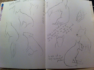
I found this exercise difficult as Ralph likes to get as close to us as possible, and as soon as I made eye contact with him he wanted to sit on me. These sketches were from two sittings, I am quite pleased with them as I managed to get his shape right - he is an English Bull Terrier so he is quite awkward to draw! He also sits in odd positions.


I then drew my brothers dog, I am quite pleased with how this drawing turned out, I like the effect charcoal gives and how I was able to move quickly without her moving too much. It was difficult getting the details like the eyes and nose right, but I managed to capture her face well.
A3 Charcoal
Next I drew some birds from photographs. I wanted to experiment with using different lines to create textures, and thought that feathers were the best thing to draw for this. I'm really pleased with how they turned out, and it was interesting looking closely at the different textures of birds feathers, and also the direction and density of them.
George Stubbs
I found George Stubbs' anatomical drawings fascinating. I looked at Stubbs' work before completing the above exercise, so when I was drawing the animals I considered their muscle and bone structures. Particularly the drawings of Ralph as he is very muscular, and the structure of his muscles show through well, so this made it easier to get the shape of him right.
Project: Drawing Animals
Research point:
Durer

Leonardo da Vinci's drawings of animals are a little looser and more relaxed than Durer's. He concentrates more on the movement and smaller details of the animals rather than the whole image. I like his sketchy looser style and would like to be able to create something similar.
Durer

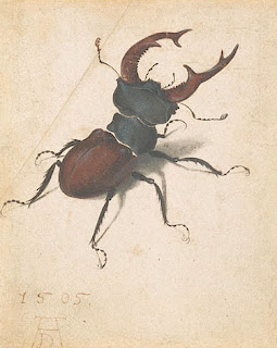
I love Durer's animal drawings, they are beautifully detailed and have a fantasy - whimsy feel to them I think. His creatures look perfectly formed and every detail has been carefully drawn.
Leonardo da Vinci
Subscribe to:
Comments (Atom)


