Monday 30 January 2012

Drawing Fruit and Vegetables in colour

It took me a couple of days to complete this exercise, at first I almost gave it all up and considered never drawing again because I am blind and can't see (this is obviously not true) but I pushed through it, and actually came out the other side having learnt something. I had a lightbulb 'ping!' moment and I realised that since starting the Start Drawing course, my drawing has improved considerably! At the end of every exercise and project, I improve, and something seems to twig.

The first drawing of the onion is bad. Bad bad bad, I think I used too many different directions of hatching and lines - so my drawing doesn't represent the true shape and depth of it. I used coloured pencil and didn't apply enough pressure, I think I had new exercise nerves. The second drawing turned out much better, I found I could follow the directions of line in the onion better, and I was more confident with applying colour. This is the first time I have used only coloured pencil in a drawing to create all the tone, so I was quite pleased with the outcome. In the past I have added tone with pencil, and then added the colour in over the top, but I can now see that this is the better way of adding colour and tone. It comes out much more natural.
The first apple didn't turn out too well - again, I didn't apply enough pressure and wasn't very confident with drawing, but the second attempt from a different angle turned out much better because I relaxed more. I kept going over the areas I had coloured to get accurate colour and tone.


I'm much more pleased with how my pear turned out, I really started to relax and used more expressive gestures when hatching and I think it looks a lot better. This was my ping! moment, that made me realise how far I have come. Hatching with colour is now a new favourite technique of mine, and something I hadn't ever tried before! So I'm really pleased with the outcome.

I then moved onto the banana - I struggled at first, wondering how I was going to get the colour right, but again I started off with the darkest areas, then with an ochre colour pencil, I began adding in colour to the darker areas. Gradually I used three shades of yellow to get quite an accurate colour. I'm pleased with how this turned out - especially when looking back at the pencil tone drawing I did a couple of weeks ago. This is definitely an improvement. Unfortunately though I struggled with my casting shadow, on all of these drawings actually, they look odd to me!

I've really struggled with hatching, but now (finally) I get it! Hooray!

Will post the final drawings and composition sketches in the next couple of days.


Wednesday 25 January 2012

Still life group using line & tone

Still life group using line


I'm really pleased with how this drawing turned out - although I think I may have concentrated on adding tone a bit too much. But still, I only used lines, and a fine liner - NO PENCIL!! And I made no mistakes! Usually I am a nervous wreck when drawing with pen, without the ability to erase a mistake, but this time I drew with confidence, and I'm really pleased with the outcome. Knowing that what I was putting on the paper was permanent made me look a lot closer at the shapes I was making. I'm really pleased with the varying tone I created using line and dots.
I first did a few smaller sketches in my sketchbook to warm up a little, this was great help as my orange came out too dark on the inside, and my kiwi lacked tone, so on my larger drawing I was able to get things right.

Still life group using tone

I enjoyed this exercise, although I was skeptical when I was doing it, as it didnt quite look right - until I had finished of course. Unfortunately my composition lets the drawing down I think, and I could've chosen a more interesting background. I like how the onion turned out - this was really fun to draw, I followed the curves of the onion and I think I captured the shape well. 


Check & log
What aspects of each drawing have been successful, and what did you have problems with?
I managed to create a good sense of tone and depth in my drawings, they are also accurate and in proportion. I had problems with the second drawing - particularly the composition, and didn't add enough tone to the pepper on the left hand side.
Did you manage to get a sense of depth in your drawings? What elements of the drawings and still life  groupings helped to create that sense?
I created a sense of depth in my drawings by adding tonal value, and ensuring the objects are the correct size in proportion to one another.
What difficulties were created by being restricted to line or tone?
I think it is hard to make drawings look realistic when drawing in line, I tried to incorporate a variety of marks and lines to add tone and shape to my objects which worked well. I found the line drawing a little daunting as I was using a fine liner and couldn't erase any mistakes, but I think this actually enhanced my drawing and made it better.

Tuesday 24 January 2012

Research point - Contrasting Artists

Renata Liwska - A children's book illustrator.

I first came across Liwska's work on book by its cover, her sketchbook drawings are so beautifully detailed and have wonderful precise lines.
Hundreds of delicate lines make up these lovely, soft, dreamy drawings. I would love to have the skill and patience to be able to use lines in such a way that forms intricate drawings like these. All of her sketches have great depth and tone by just using line - which is something I really struggle with. 

Henri Matisse 

Next I investigated the work of Matisse, his line drawings, although simple are still striking and full of character.


The lack of tone and shading in a lot of Matisse's work is made up, I think, by the compositions of his drawings. His subjects fill the page well and create interesting and dynamic drawings. The expressive marks he uses creates a sense of movement which makes your eyes dance around the image.


Tuesday 17 January 2012

Project - Detailed Observation

I must admit I have really struggled to get into this unit, which is odd because I am a nature freak, and I love drawing natural objects. I am obsessed with eating vegetables, and I go out for walks all the time. I should be full of inspiration and ideas.  Over the Christmas period I slacked completely and didn't pick up a pencil for about 3 weeks. Every time I walked past my sketchbook I felt guilty and panicky and anxious. Every time I ate a piece of fruit I knew I should've drawn it first.  So my drawings so far have been pretty lackluster and I am reluctant to post them on here, but I must and I will. I am feeling more eager and confident now to crack on to the Still Life project. Anyway, here goes!

Line drawing detail
I wasn't very adventurous with my choice of object for this drawing, but it was the only object I could find with interesting lines.
I am actually quite pleased with this drawing, I used a brown fine-liner, and tried very hard to keep just one continuous line. I changed the angle of the pepper a few times - and drew the outside of it too, but I think the most interesting part is the inside.


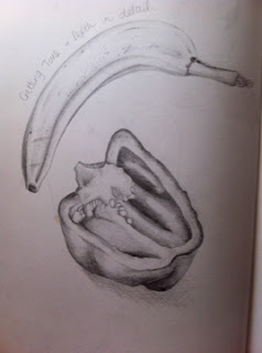
Getting tone and depth in detail
Again I could've been more adventurous with my objects for this drawing, but I had Aurel Schmidt's bananas floating around in my mind so I knew I had to draw one. I am pleased with my banana, and I think in both objects I achieved a good amount of tone by hatching (for some reason I didn't include any cast shadow when drawing the banana??). I used a graphite pencil and a 6B and 8B pencil, then highlighted areas with an eraser. I definitely think I could've added more texture on the inside of the pepper as it looks a little flat. 
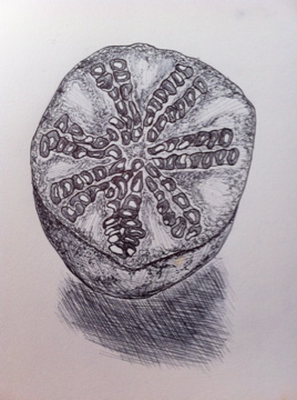


Stipples and dots
I am not pleased with my stipples and dots drawing AT ALL (it is a pomegranate by the way) this exercise made me realise I am not comfortable drawing in biro, I just can't control the tone of it enough, and not being able to erase makes me draw all stiff and anxiously. I used a variety of line, hatching, dots and wobbly scribbly lines but unfortunately it didn't work for me! My pomegranate had so much promise to be an interesting object to draw. It is still sitting on my desk, decomposing slightly, so it could make an appearance again soon.


Check & Log

Which drawing media did you find the most effective to use, for which effects? 
What sort of marks work well to create, tone, pattern and texture?
Although line drawings have a nice look about them, for tone and depth I definitely think pencil is the best. Biro and drawing pen can create nice texture if used properly. Crosshatching creates a nice variable tone, but I found that varying the tones with biro was a little difficult, I may practice it more though as I know it can be done! Stippling is best for adding texture and pattern to smaller, detailed areas, rather than large sections.


Did you enjoy capturing details or are you more at home creating big broad brush sketches?
I feel more comfortable capturing the details of things as I am very observant, and like to study things up closely and work on a smaller scale. I often find that big sketches intimidate me as the page looks so massive compared to my hands and drawing tools. This is something I need to work on though, as larger, looser drawings I did in part one of this course was enjoyable and the outcome was good.

Did doing a line drawing get you to look at space more effectively?
Definitely - I often do little continuous line drawings before completing a larger piece as it is a good warm up exercise and gets me into 'looking mode'.


Research Point 1 - Albrecht Durer

I found out about Durer's work on the Bridgeman Education Library - and funnily enough when I went back to researching Aurel Schmidt, there was a reference to Durer's work.

  A Young Hare - Watercolour & Gouache.
I love the details in the hare's fur - each strand of hair is accounted for and is delicately painted. Durer would lightly sketch his images first, underpaint them with watercolours, and then gradually build up layers of texture of the fur using both watercolour and gouache, using light and heavy brushstrokes to create a beautifully textured painting.

Wing of a Roller 

I love this painting, the detail absolutely captivates me. The colours are beautiful and almost appear to shimmer and glisten. It looks as though if it were attached to a bird, it could fly right out of the page.


I am not usually a fan of studies of skulls, but looking at Durer's drawing makes me want to have a go myself. This drawing was done in pen, ink and chalk. I love the areas that have been highlighted in white chalk, and the light casting on the left hand side which has been carefully hatched. I will definitely be having a go at using chalk/soft pastel in this way.

Research Point 1 - Aurel Schmidt

I can't remember how I stumbled across Aurel Schmidt's work - but as soon as I saw it I was wowed. The beautiful intricate lines and lifelike details are incredible. I must admit, I was a little naive when I checked out her work - it took me a little while to notice that some of her pieces were made up of drawings of cigarette butts and maggots. But still - they are beautiful nevertheless.


Aurel Schmidt's work is unbelievably detailed, some of her drawings are so realistic I feel as though I could reach inside and hold the objects in my hands. Most of her work has dark, seedy undertones, but she also includes a contrast of beautiful flowers and wildlife.

Aurel Schmidt mostly uses coloured pencils and acrylic paint in her work, I think together these mediums work really well in creating detail and depth. 


Beautiful!

Tuesday 3 January 2012

OCA Start Drawing - Part 2 Observation in Nature

I am late to the party with blogging! For my first OCA unit I stuck to what I know best and used a sketchbook for my learning log, but as a perfectionist it seemed to take so much time, so for my next assignment and hopefully for the rest- I will use this! I also thought this would be a good way to keep in contact with other OCA students.

Exploring coloured media

 Soft Pastel
+ Smudges and blend well, looks good blended with water, expressive marks
- Some areas don't blend well and clump together

Oil Pastel
+ Looks good when etched into
- Doesn't smudge wel or blend with other colours

Watercolour Pencils
+ Adds nice texture and depth, looks good added to watercolour paints
Colours don't always blend very well

Metallic Pencils
+ Certain colours blended nicely, would be good for adding highlighted areas to drawings

Coloured Pencils
+ Works well hatched over watercolour and with eraser to add highlights
- Need fine grain paper as too much of the paper shows through

Felt Tip Pens
+ Really interesting with water added
- Colours don't mix and its hard to vary the pressure effectively

Coloured Biro
- Doesn't blend very well, and colour selection isn't very good

Staedtler Pens
+ Nice vibrant colours, good quality of line
- Colours don't blend

Wax Crayons
+ Look great melted and mixed, can etch into, could be very expressive
- Colours don't blend very well and doesn't create solid areas of colour

I think the best medium  for detailed work would be the pencil colours and perhaps the coloured biros as they have very delicate tips. When using coloured pencils I always find they are excellent for creating detailed lines.
My favourite medium that I experimented with here is the melted wax crayons, I think - used correctly and with a bit of practice I could make some lovely marks and textures with them!