Wednesday 4 April 2012

Assignment 2


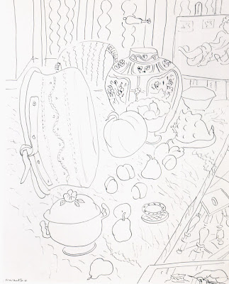
I hate oil pastel. Every time I draw with oil pastel it ends up looking like a child has drawn it. So I decided to give myself a challenge with this assignment and use the material I feel least confident working with. I thought about using coloured pencil or charcoal, but I wanted to portray the vivid colours of the objects and I think oil pastel does this well. I am actually pleased with this drawing, although looking at it now, I feel there are a few things I could change - the bottles don't quite look right and the wall and table needs blending a little more. I think I captured the vegetables really well though, particularly the leek and the tomatoes, I managed to get the texture looking just right. Looking at this piece makes me realise how far I have come since starting this course. I have improved ten fold I think.

I practiced with the oil pastel in my sketchbook, which made me even more worried as the drawings I was doing did not look very good at all (check out the leek!) I then had a go at blending dark areas and decided that graphite pencil worked well.

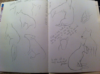
Composition is something I always struggle with so I wanted to get it right this time. I did a few sketches in my sketchbook, and gradually added more objects. I looked at a few books on still life and this really helped me build up a nice composition. I think I filled the space nicely, and there is a good variety of shapes, sizes and textures.

Next I experimented with different papers. I chose four different ones, all with different grades of smoothness, graduating from super smooth to rough. I found that on the super smooth paper it was hard to blend the colours without the pastel lifting off the paper too much. The rougher papers I found were a little too rough, and too much of the paper underneath showed. This created a nice textured effect - however as some of the objects were smooth, I didn't think this would work well. I opted for paper number 2, which was slightly smooth, but still had a little bit of texture. I then practiced drawing some of my objects to get the correct colour palate and tones.

Summary

I've enjoyed this unit, and think I have improved my drawing skills greatly. While some of the exercises have been challenging, I feel I actually found this unit slightly easier than the previous. Perhaps because I understand the principles of drawing better now. I have definitely made some mistakes along the way, but I must be doing alright because of how my drawing is improving. How I see light and shadow has definitely improved, and I feel more confident with different materials. During this unit I have learnt how to use line and marks, how to hatch with colour - this is the one I am most pleased about I think as I have struggled with hatching. I have learnt how to use oil pastel correctly, and my compositions have improved a little. Overall I am pleased with my progress and can't wait to move onto the next assignment.

Tuesday 3 April 2012

Fish on a plate


I was not looking forward to this exercise at all, I bought my fish - a rainbow trout and slid it out of its bag and onto the plate. I'm not a squeamish person at all, but I did not enjoy having a fish staring at me. I started by drawing the outlines of the plate and fish very lightly and then once I was satisfied I added watercolour to the coloured areas to add a better density of colour. I did some experiments in my sketchbook and found this way looked best - watercolour with coloured pencil on top. After about an hour or so, I really started to enjoy doing this exercise, and I am really pleased with how it turned out. Although looking at the photo of it I am going to go back to it and sort out the outline of the plate. I mostly used cross hatching to colour the fish in, which added the perfect texture. It was difficult getting the colours right at first, but I think I got the colours quite accurately, and succeeded in showing the iridescent shine the fish has. This is definitely a subject I would like to return to - despite the smell!


Check and Log

What were the main challenges of drawing animals?
I think the main challenge was Ralph not sitting still, which meant having to stop a drawing midway and starting again. I also found it quite challenging drawing the eyes, it is easy to make animals look evil by getting the eyes wrong! 
Which media did you enjoy using most and which did you feel were best for the subject matter and why?I enjoyed using the mechanical pencil when drawing the birds, as these are excellent at getting fine, delicate lines. I also found the charcoal enjoyable as it is nice and loose. And also very forgiving if you make a mistake, or two. The coloured pencils were fantastic for the fish drawing, they blend well together and the cross hatching created the right texture.
Where can you go to draw more animals? Think about the sort of places that will give you opportunities for animal drawing. Have you tried drawing a moving animal yet?
I am lucky to live right by a nature reserve so this will be excellent for practicing bird drawings. I haven't tried drawing a moving animal, I will definitely be revisiting drawing animals as it was enjoyable and I feel there is much more I could do.

Exercise: Grabbing the Chance

I found this exercise difficult as Ralph likes to get as close to us as possible, and as soon as I made eye contact with him he wanted to sit on me. These sketches were from two sittings, I am quite pleased with them as I managed to get his shape right - he is an English Bull Terrier so he is quite awkward to draw! He also sits in odd positions.


I then drew my brothers dog, I am quite pleased with how this drawing turned out, I like the effect charcoal gives and how I was able to move quickly without her moving too much. It was difficult getting the details like the eyes and nose right, but I managed to capture her face well.

 A3 Charcoal
Next I drew some birds from photographs. I wanted to experiment with using different lines to create textures, and thought that feathers were the best thing to draw for this. I'm really pleased with how they turned out, and it was interesting looking closely at the different textures of birds feathers, and also the direction and density of them.


George Stubbs


I found George Stubbs' anatomical drawings fascinating. I looked at Stubbs' work before completing the above exercise, so when I was drawing the animals I considered their muscle and bone structures. Particularly the drawings of Ralph as he is very muscular, and the structure of his muscles show through well, so this made it easier to get the shape of him right.

Project: Drawing Animals

Research point:

Durer


I love Durer's animal drawings, they are beautifully detailed and have a fantasy - whimsy feel to them I think. His creatures look perfectly formed and every detail has been carefully drawn.

Leonardo da Vinci 

Leonardo da Vinci's drawings of animals are a little looser and more relaxed than Durer's. He concentrates more on the movement and smaller details of the animals rather than the whole image. I like his sketchy looser style and would like to be able to create something similar.


Sunday 4 March 2012

Drawing Plants and Flowers

Negative Space

I chose quite a complicated plant for this drawing - well, when I looked at it before drawing it, I thought it was going to be very complicated but actually, once I got going it was quite easy. I concentrated hard on the negative space, drawing the shapes between the flowers and stalks to ensure the spacing between was correct and that the shapes and sizes were all right. It took a long, long, looong time, but I really enjoyed completing this exercise and I am pleased with the outcome.


Plants and flowers in coloured pencil

I spent quite a while preparing for this drawing. I practiced layering different colours, different pencils, using different paper, applying watercolour washes etc. I decided I liked the watercolour wash so tried that on A3 paper. I didn't stretch my paper though, and ended up with a crinkly mess. So I gave up on that idea - but I am glad it went wrong as I don't think it would've looked right anyway. I'm pleased with my drawing - the photo I took of it is a little too dark. For the first time my background does not look too awful! Yippee! It is not perfect though (the background isn't completely right, particularly the window and curtains) I am mostly pleased with how the leaves and the flowers turned out. I struggled at first when layering up the coloured pencils as I didn't think it was going to work, but somehow it all came together quite nicely. I am pleased with my composition too.

Drawing with other colour media

There is no image to follow for this piece as it came out terribly. I didn't even finish it because it looked like a child had drawn it, or like I had drawn it using my feet instead of my hands. I used oil pastel, and I just couldn't get enough detail with it, so it just looked like a scribbly mess. I will come back to this drawing though and start over another day- at the moment though I just want to continue onto the next project. I am disappointed as I really enjoy experimenting with other media.


Drawing with other colour media round 2

This is my second attempt at the exercise. I am much happier with this compared to my first attempt. I sketched out the outline of the plant, then with a white wax crayon I scribbled around the edges and highlighted areas of the drawing. Then with watercolour, I washed over areas, selecting similar colours but not being too precious about it. I then added some extra colour with oil pastel using loose scribbles just to highlight parts of the drawing. I quite like this style and will definitely experiment with wax crayons and watercolour this way again.


Check and Log

How will your experiments with negative space help your observational drawing in the future?
Experimenting with negative space has helped me greatly already. It made me concentrate on drawing what I could see - not what I thought I could see, it helped me to look really closely at the shapes I was drawing.

What techniques did you use to ensure you drew your plants in proportion?
I lightly sketched the outline of the objects to make sure they would all fit on the page. I then used my hand to 'measure' the objects to ensure they were all in correct proportion to eachother. I also looked at the negative shapes around the objects.

How did you achieve an effect of three-dimensional space in your drawings?
I found it easier to create three-dimensional space in my coloured pencil drawing, as I made sure I added in light and dark tones. I found it difficult to achieve this with the oil pastel - I tried, but it all came out far too dark. I also made sure the perspective of the windowsill was correct, I think this really helped to add a three-dimenstional feel to it.

Research Point - Ben Nicholson

Ben Nicholson was strongly influenced by his father, William Nicholson, he began by painting his still lifes in a style similar to that of his fathers.

This changed in 1920 and for the next few years his work altered rapidly as he experimented with different modes of working.


Throughout his career, Nicholson frequently travelled and painted inspirational locations, from the Scottish borders to Cornwall. He particularly liked locations that were remote and a sense of distance.
In the 1930s, Nicholson became Britains leading expodent of Modernism. Influenced by Mondrian, Picasso and Braque - Nicholsons wor was still ever changing, from his white reliefs to a series of blocks of colour, however Nicholson would still return to still life, incorporating compositions of cups and jugs like his earlier work.

One of Nicholsons great influences was his wife Barbara Hepworth, his work changed significantly during the time they met. Before the war broke out, they left London and returned to an area of great significance to Nicholson - the St Ives area in Cornwall, it was here that he created some of his most recognised pierces of art. Nicholson stayed committed to his love of abstration and reinforced the constructivist side of his approach. He seemed to pull together many aspects of his previous work, creating abstract - still life - landscape paintings.


Nicholson included windowsills and tables in his paintings, leaving the viewer feeling like they are involved in the image and can place themselves there. The idea then evolved to the objects becoming simple lines and shapes on the landscape which bear a similar resemblance to his earlier reliefs. The objects look as though they could almost be part of the landscape.

Tuesday 7 February 2012

Drawing Fruit and Vegetables in colour final drawings

Exercise: Using hatching to create tone


I carried on using coloured pencils for this drawing as I really enjoyed using them when practicing hatching. I'm pleased with this drawing, I had a real breakthrough with hatching during this exercise and I think I've finally got the hang of it. Unfortunately though I am not pleased with my composition, I sketched out various compositions, and this one looked like the better option, however on a large scale it looks rubbish, there is far too much uninteresting negative space surrounding the objects. I think I concentrated too much on ensuring the objects fit on the page.

Exercise: Using markers or dip pens


I used a range of cheap felt tip pens for this exercise. This was my second attempt at this exercise, I first tried loosing hatching the objects, but this looked terrible. The dark areas came out too dark, and it all just looked like a giant mess. So I researched a few artists that use felt tip pens for their work, I then tried using the felt tip pens in a tighter way - making sure I was concentrating on the details of the objects, this turned out better - but I still didn't like the outcome of this piece. I have just invested in some better pens so will practice further using them, I think marker pens have the potential to look great! I also ruined this by adding in some colour in the background of the tablecloth. Doh!

Exercise: Drawing using oil pastel


I'm not very pleased with this, I think I captured the light and colours of the objects well - unfortunately the photo does not show the colouring accurately. This picture does look better in real life. I promise. Again I think my composition and background ruin the drawing. I will admit, I seem to lose interest after I have drawn my objects, and lose enthusiasm when I have to draw something less interesting such as a chopping board or tablecloth. But next time I will attack the background with as much enthusiasm because I have learnt my lesson!! I have ruined two potentially good drawings by rushing and getting the backgrounds wrong.

Check and log

Your composition should occupy most of the paper's surface. How much negative space do you have left?
This project has made me realise that I really struggle with composition, I usually end up with too much or too little space. this is definitely something I need to research and work on, as I feel I have ruined quite a few potentially good drawings by not planning my composition enough. My finished pieces are filled with blank, negative space, I also have a problem with including background which I have highlighted above.

What have you learned from drawing the details of fruit and vegetables?
I have learnt a lot from this project - I had a great breakthrough with hatching and learnt how to add colour using coloured pencils properly. I feel like I understand light and shadow more after completing these drawings, as fruit and vegetables have variable textures, it was a real challenge representing casting light realistically. As cheesy as it sounds, I learnt to keep trying! I had real trouble with felt tips and didn't like the techniques I was using, so I researched and tried a different approach and improved my drawing.

What did you find most challenging about this part of the course?
I found this part of the course the most challenging yet, but also the rewarding. I dedicated a lot of time to each exercise, really thinking about what I was doing, and found that at the end of each one I felt pleased and that I had achieved something. I think I have come quite far and improved a lot compared to the beginning of the course. My biggest challenge was getting to grips with the materials, the pen and oil pastel drawing was a real challenge as they are not materials I am confident using. I am pleased with certain aspects of each of the drawings, and think I have captured the objects well, the lighting and texture too - but it is just unfortunate that I choose awful compositions.

Monday 30 January 2012

Drawing Fruit and Vegetables in colour

It took me a couple of days to complete this exercise, at first I almost gave it all up and considered never drawing again because I am blind and can't see (this is obviously not true) but I pushed through it, and actually came out the other side having learnt something. I had a lightbulb 'ping!' moment and I realised that since starting the Start Drawing course, my drawing has improved considerably! At the end of every exercise and project, I improve, and something seems to twig.

The first drawing of the onion is bad. Bad bad bad, I think I used too many different directions of hatching and lines - so my drawing doesn't represent the true shape and depth of it. I used coloured pencil and didn't apply enough pressure, I think I had new exercise nerves. The second drawing turned out much better, I found I could follow the directions of line in the onion better, and I was more confident with applying colour. This is the first time I have used only coloured pencil in a drawing to create all the tone, so I was quite pleased with the outcome. In the past I have added tone with pencil, and then added the colour in over the top, but I can now see that this is the better way of adding colour and tone. It comes out much more natural.
The first apple didn't turn out too well - again, I didn't apply enough pressure and wasn't very confident with drawing, but the second attempt from a different angle turned out much better because I relaxed more. I kept going over the areas I had coloured to get accurate colour and tone.


I'm much more pleased with how my pear turned out, I really started to relax and used more expressive gestures when hatching and I think it looks a lot better. This was my ping! moment, that made me realise how far I have come. Hatching with colour is now a new favourite technique of mine, and something I hadn't ever tried before! So I'm really pleased with the outcome.

I then moved onto the banana - I struggled at first, wondering how I was going to get the colour right, but again I started off with the darkest areas, then with an ochre colour pencil, I began adding in colour to the darker areas. Gradually I used three shades of yellow to get quite an accurate colour. I'm pleased with how this turned out - especially when looking back at the pencil tone drawing I did a couple of weeks ago. This is definitely an improvement. Unfortunately though I struggled with my casting shadow, on all of these drawings actually, they look odd to me!

I've really struggled with hatching, but now (finally) I get it! Hooray!

Will post the final drawings and composition sketches in the next couple of days.


Wednesday 25 January 2012

Still life group using line & tone

Still life group using line


I'm really pleased with how this drawing turned out - although I think I may have concentrated on adding tone a bit too much. But still, I only used lines, and a fine liner - NO PENCIL!! And I made no mistakes! Usually I am a nervous wreck when drawing with pen, without the ability to erase a mistake, but this time I drew with confidence, and I'm really pleased with the outcome. Knowing that what I was putting on the paper was permanent made me look a lot closer at the shapes I was making. I'm really pleased with the varying tone I created using line and dots.
I first did a few smaller sketches in my sketchbook to warm up a little, this was great help as my orange came out too dark on the inside, and my kiwi lacked tone, so on my larger drawing I was able to get things right.

Still life group using tone

I enjoyed this exercise, although I was skeptical when I was doing it, as it didnt quite look right - until I had finished of course. Unfortunately my composition lets the drawing down I think, and I could've chosen a more interesting background. I like how the onion turned out - this was really fun to draw, I followed the curves of the onion and I think I captured the shape well. 


Check & log
What aspects of each drawing have been successful, and what did you have problems with?
I managed to create a good sense of tone and depth in my drawings, they are also accurate and in proportion. I had problems with the second drawing - particularly the composition, and didn't add enough tone to the pepper on the left hand side.
Did you manage to get a sense of depth in your drawings? What elements of the drawings and still life  groupings helped to create that sense?
I created a sense of depth in my drawings by adding tonal value, and ensuring the objects are the correct size in proportion to one another.
What difficulties were created by being restricted to line or tone?
I think it is hard to make drawings look realistic when drawing in line, I tried to incorporate a variety of marks and lines to add tone and shape to my objects which worked well. I found the line drawing a little daunting as I was using a fine liner and couldn't erase any mistakes, but I think this actually enhanced my drawing and made it better.

Tuesday 24 January 2012

Research point - Contrasting Artists

Renata Liwska - A children's book illustrator.

I first came across Liwska's work on book by its cover, her sketchbook drawings are so beautifully detailed and have wonderful precise lines.
Hundreds of delicate lines make up these lovely, soft, dreamy drawings. I would love to have the skill and patience to be able to use lines in such a way that forms intricate drawings like these. All of her sketches have great depth and tone by just using line - which is something I really struggle with. 

Henri Matisse 

Next I investigated the work of Matisse, his line drawings, although simple are still striking and full of character.


The lack of tone and shading in a lot of Matisse's work is made up, I think, by the compositions of his drawings. His subjects fill the page well and create interesting and dynamic drawings. The expressive marks he uses creates a sense of movement which makes your eyes dance around the image.


Tuesday 17 January 2012

Project - Detailed Observation

I must admit I have really struggled to get into this unit, which is odd because I am a nature freak, and I love drawing natural objects. I am obsessed with eating vegetables, and I go out for walks all the time. I should be full of inspiration and ideas.  Over the Christmas period I slacked completely and didn't pick up a pencil for about 3 weeks. Every time I walked past my sketchbook I felt guilty and panicky and anxious. Every time I ate a piece of fruit I knew I should've drawn it first.  So my drawings so far have been pretty lackluster and I am reluctant to post them on here, but I must and I will. I am feeling more eager and confident now to crack on to the Still Life project. Anyway, here goes!

Line drawing detail
I wasn't very adventurous with my choice of object for this drawing, but it was the only object I could find with interesting lines.
I am actually quite pleased with this drawing, I used a brown fine-liner, and tried very hard to keep just one continuous line. I changed the angle of the pepper a few times - and drew the outside of it too, but I think the most interesting part is the inside.


Getting tone and depth in detail
Again I could've been more adventurous with my objects for this drawing, but I had Aurel Schmidt's bananas floating around in my mind so I knew I had to draw one. I am pleased with my banana, and I think in both objects I achieved a good amount of tone by hatching (for some reason I didn't include any cast shadow when drawing the banana??). I used a graphite pencil and a 6B and 8B pencil, then highlighted areas with an eraser. I definitely think I could've added more texture on the inside of the pepper as it looks a little flat. 


Stipples and dots
I am not pleased with my stipples and dots drawing AT ALL (it is a pomegranate by the way) this exercise made me realise I am not comfortable drawing in biro, I just can't control the tone of it enough, and not being able to erase makes me draw all stiff and anxiously. I used a variety of line, hatching, dots and wobbly scribbly lines but unfortunately it didn't work for me! My pomegranate had so much promise to be an interesting object to draw. It is still sitting on my desk, decomposing slightly, so it could make an appearance again soon.


Check & Log

Which drawing media did you find the most effective to use, for which effects? 
What sort of marks work well to create, tone, pattern and texture?
Although line drawings have a nice look about them, for tone and depth I definitely think pencil is the best. Biro and drawing pen can create nice texture if used properly. Crosshatching creates a nice variable tone, but I found that varying the tones with biro was a little difficult, I may practice it more though as I know it can be done! Stippling is best for adding texture and pattern to smaller, detailed areas, rather than large sections.


Did you enjoy capturing details or are you more at home creating big broad brush sketches?
I feel more comfortable capturing the details of things as I am very observant, and like to study things up closely and work on a smaller scale. I often find that big sketches intimidate me as the page looks so massive compared to my hands and drawing tools. This is something I need to work on though, as larger, looser drawings I did in part one of this course was enjoyable and the outcome was good.

Did doing a line drawing get you to look at space more effectively?
Definitely - I often do little continuous line drawings before completing a larger piece as it is a good warm up exercise and gets me into 'looking mode'.


Research Point 1 - Albrecht Durer

I found out about Durer's work on the Bridgeman Education Library - and funnily enough when I went back to researching Aurel Schmidt, there was a reference to Durer's work.

  A Young Hare - Watercolour & Gouache.
I love the details in the hare's fur - each strand of hair is accounted for and is delicately painted. Durer would lightly sketch his images first, underpaint them with watercolours, and then gradually build up layers of texture of the fur using both watercolour and gouache, using light and heavy brushstrokes to create a beautifully textured painting.

Wing of a Roller 

I love this painting, the detail absolutely captivates me. The colours are beautiful and almost appear to shimmer and glisten. It looks as though if it were attached to a bird, it could fly right out of the page.


I am not usually a fan of studies of skulls, but looking at Durer's drawing makes me want to have a go myself. This drawing was done in pen, ink and chalk. I love the areas that have been highlighted in white chalk, and the light casting on the left hand side which has been carefully hatched. I will definitely be having a go at using chalk/soft pastel in this way.

Research Point 1 - Aurel Schmidt

I can't remember how I stumbled across Aurel Schmidt's work - but as soon as I saw it I was wowed. The beautiful intricate lines and lifelike details are incredible. I must admit, I was a little naive when I checked out her work - it took me a little while to notice that some of her pieces were made up of drawings of cigarette butts and maggots. But still - they are beautiful nevertheless.


Aurel Schmidt's work is unbelievably detailed, some of her drawings are so realistic I feel as though I could reach inside and hold the objects in my hands. Most of her work has dark, seedy undertones, but she also includes a contrast of beautiful flowers and wildlife.

Aurel Schmidt mostly uses coloured pencils and acrylic paint in her work, I think together these mediums work really well in creating detail and depth. 


Beautiful!

Tuesday 3 January 2012

OCA Start Drawing - Part 2 Observation in Nature

I am late to the party with blogging! For my first OCA unit I stuck to what I know best and used a sketchbook for my learning log, but as a perfectionist it seemed to take so much time, so for my next assignment and hopefully for the rest- I will use this! I also thought this would be a good way to keep in contact with other OCA students.

Exploring coloured media

 Soft Pastel
+ Smudges and blend well, looks good blended with water, expressive marks
- Some areas don't blend well and clump together

Oil Pastel
+ Looks good when etched into
- Doesn't smudge wel or blend with other colours

Watercolour Pencils
+ Adds nice texture and depth, looks good added to watercolour paints
Colours don't always blend very well

Metallic Pencils
+ Certain colours blended nicely, would be good for adding highlighted areas to drawings

Coloured Pencils
+ Works well hatched over watercolour and with eraser to add highlights
- Need fine grain paper as too much of the paper shows through

Felt Tip Pens
+ Really interesting with water added
- Colours don't mix and its hard to vary the pressure effectively

Coloured Biro
- Doesn't blend very well, and colour selection isn't very good

Staedtler Pens
+ Nice vibrant colours, good quality of line
- Colours don't blend

Wax Crayons
+ Look great melted and mixed, can etch into, could be very expressive
- Colours don't blend very well and doesn't create solid areas of colour

I think the best medium  for detailed work would be the pencil colours and perhaps the coloured biros as they have very delicate tips. When using coloured pencils I always find they are excellent for creating detailed lines.
My favourite medium that I experimented with here is the melted wax crayons, I think - used correctly and with a bit of practice I could make some lovely marks and textures with them!